Overview
Sea Save Foundation (SSF) is a Southern California-based non-profit that has been advocating for ocean ecosystem preservation since 1994. In 2023, our design team had the opportunity to work directly with its stakeholders to redesign their website in order to make it more enticing and intuitive to their target audience.
Role: UX Researcher
Company: Sea Save Foundation
Timeline: Six weeks
Design Tool: Figma
Research Methods: Heuristics Evaluation, Competitor Analysis, Card Sorting, and Usability Testing
Team Composition: Graphic Designer, Project Manager, Technical Designer, UX Designer and UX Researcher

How Might We...
Understand our community's volunteering habits, motivations, key causes and challenges to inform user-centered strategies and empower effective stewardship of the ocean conservation?
By reframing our problem statement as the above to have it guide our research, we started delving into the ocean conservancy field to learn more about SSF's target audience and how we could translate their motivations and pain points into a website design that makes sense and caters to that crowd. As a result, the following goals stemmed out of this quest:
• Learn about people's volunteering habits, and what causes or organizations are important to them.
•.Understand what motivates different supporters of the non-profit, and what they hope to gain from their involvement.
• Identify the challenges and opportunities that our users encounter in their efforts to protect and raise awareness about oceans.

The Challenge
During the stakeholder interviews, three constraints regarding the redesign of the SSF website were evidenced:
• Information driven: SSF’s mission is to disseminate information regarding current environmental challenges and legislation that can solve these issues. Thus, the newsletter pop-up was deemed an essential feature and it should be maintained on every page of the redesign.
• Color Palette: SSF’s contrasting color scheme encompasses shades of blue and pink. The stakeholder was adamant that those colors remained the same due to the vast collection of printed and physical materials the organization already has and works with during roadshows.
• Website Hosting Platform: The current SSF website is built on WordPress, which allows organization volunteers to update information and manipulate content live at events and on the road. However, the platform limits the implementation of certain design styles.

Heuristic Evaluation
The heuristic evaluation of the original website revealed significant areas for improvement.
SSF's website lacked proper color schemes and interactive elements, and featured a complex navigation structure.
Through the redesign process, the team has successfully addressed these issues, making the website more user-friendly. Incorporating a visually appealing color palette, intuitive interactions, and a simplified navigation system has transformed the user experience.
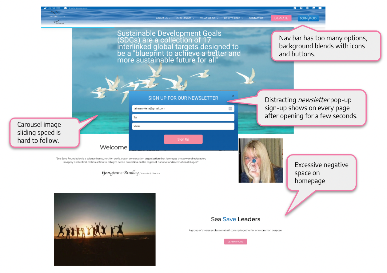
Heuristic Evaluation of Original SSF Website Homepage

Competitor Analysis
It was vital to learn examples of successful website designs that direct and indirect non-profit competitors had created in order to make better informed decisions with SSF's redesign.
• Content Organization: Nature.org has a clean and effective nav bar which was adopted in the SSF redesign.
• Information: Oceana is a leader in ocean conservancy efforts through disseminating information. Their newsletter's engaging style inspired SSFs.
• Look & Feel: Padi’s clean underwater interface featuring diving expeditions in a business-like manner guided SSF’s redesign approach.
• Visual Assets: Redesign incorporated features observed in oceanonservancy.org to make stories more compelling.
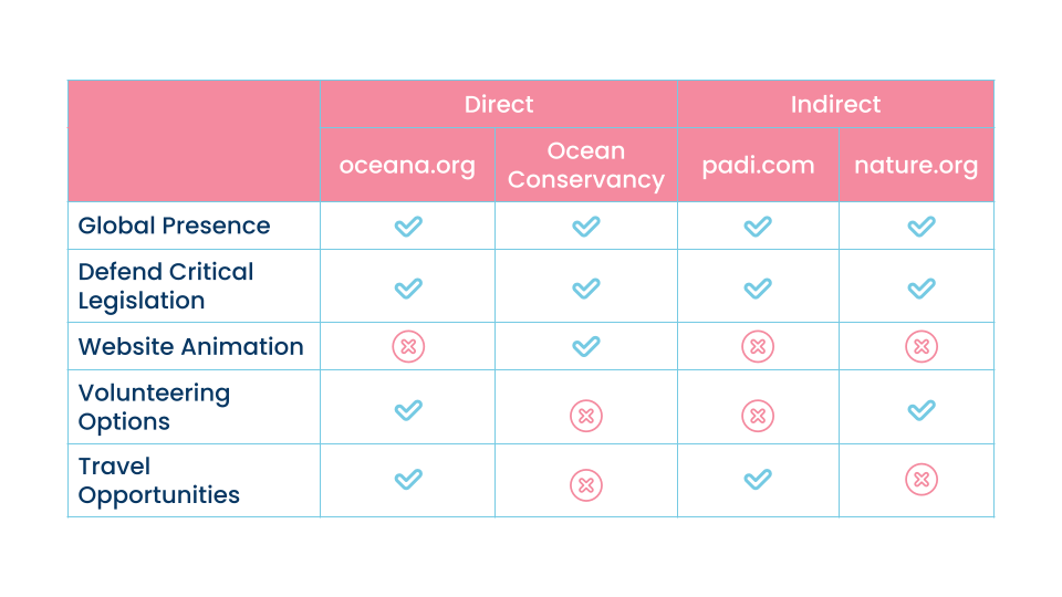
SSF's Direct & Indirect Competitors

Card Sorting
After card sorting the original SSF website navigational items, About Us was changed to Who We Are to make a clear distinction from other navigation bar items. Contact Us was removed as a main nav bar item to later be included in Who We Are, and duplicated in the footer. Separate blog content pieces were merged together into It’s your ocean in the drop-down menu for an intuitive navigation.
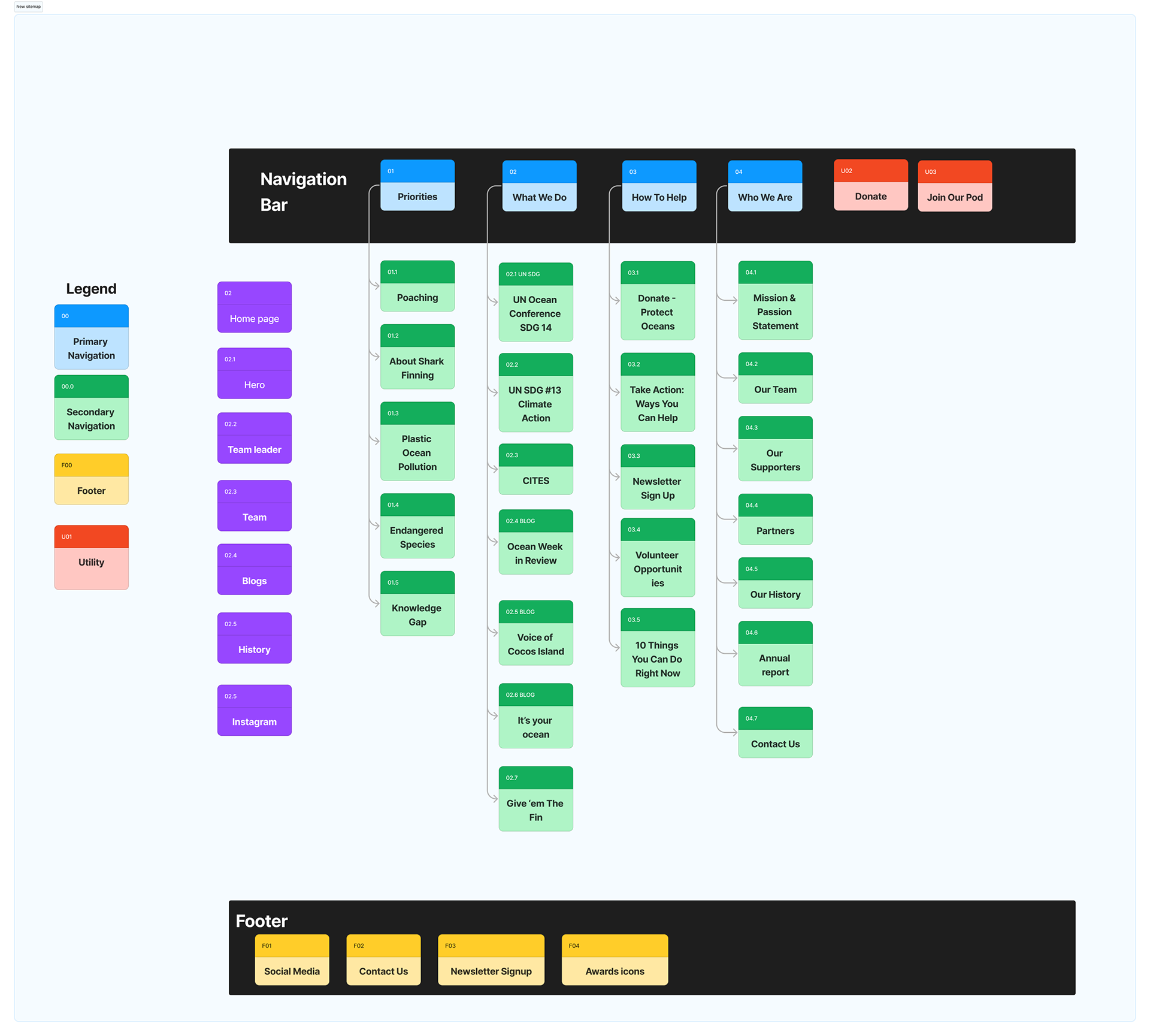
SSF Website Redesign Site Map

Usability Testing
Lo-fi & hi-fi testings ensured the final website redesign was vetted by users and that its navigation was intuitive and familiar yet exciting. Users provided essential feedback regarding how pages needed more white space for breathing room, speed of carousel images needed to be slowed down, and size of newsletter pop-up should be smaller to be as least disruptive as possible.
User Quotes:
• “Should there be indicators for different testimonials in the carousel like dots maybe?”
• “It is a much cleaner display compared to the original website”.
• “I like how articles are changing slower, they changed really fast before.”
• “Pop-up newsletter is too big, could be a bit smaller.”
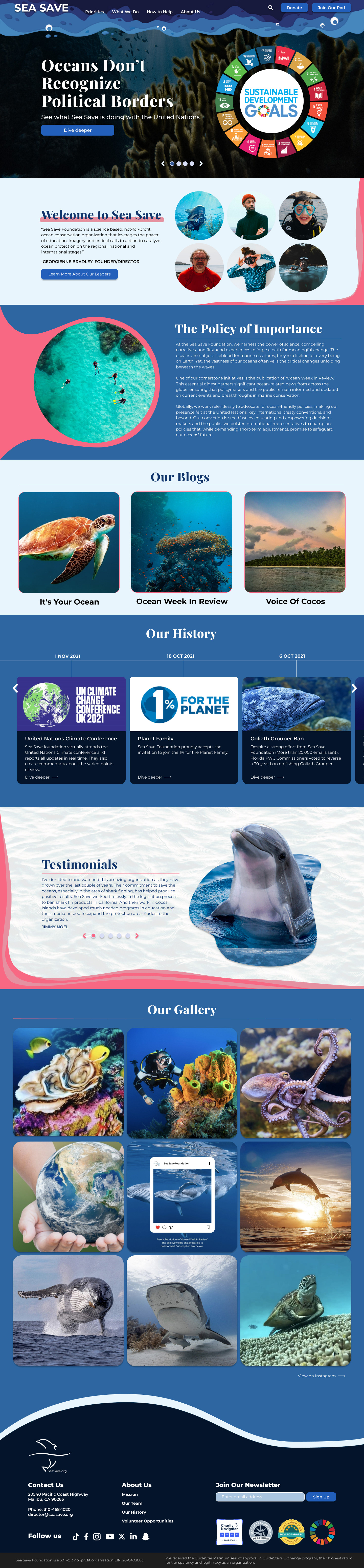
Final Version of SSF's Website Redesign

Lessons Learned
• Stakeholder Interactions: Due to busy schedules, opportunities to speak with stakeholders may be rare; therefore, every interaction must be strategic and straightforward to leverage the time and obtain key insights to navigate future roadblocks in the design process.
• Design Constraints: Understanding constraints and asking questions in the beginning of the design process preemptively saves the design team considerable time as it ensures the work develops in the correct course.
• Website Hosting Platform: Knowing the capabilities of hosting platforms that clients will use before putting a design work together helps avoiding frustration when content cannot be transferred from design tool (e.g. Figma) to target platform. Although the result of SSF's redesign is appealing, some features and bold designs are not compatible with Wordpress constraints.

Figma Prototypes: Web & Mobile
Exit/opt out of cookie dialogue, restart frames if needed, and click diagonal double arrows to enlarge Figma prototype on upper right corner of screens below.
Thanks for taking the time to see this project. Let's connect!